Ruth Ansel: Orchestrator of Magazine Design
In celebration of Ruth Ansel’s fifty-first anniversary of her career, I created an exhibition branding to let fans know when The Met Museum will be showcasing her work throughout her career.
About the project
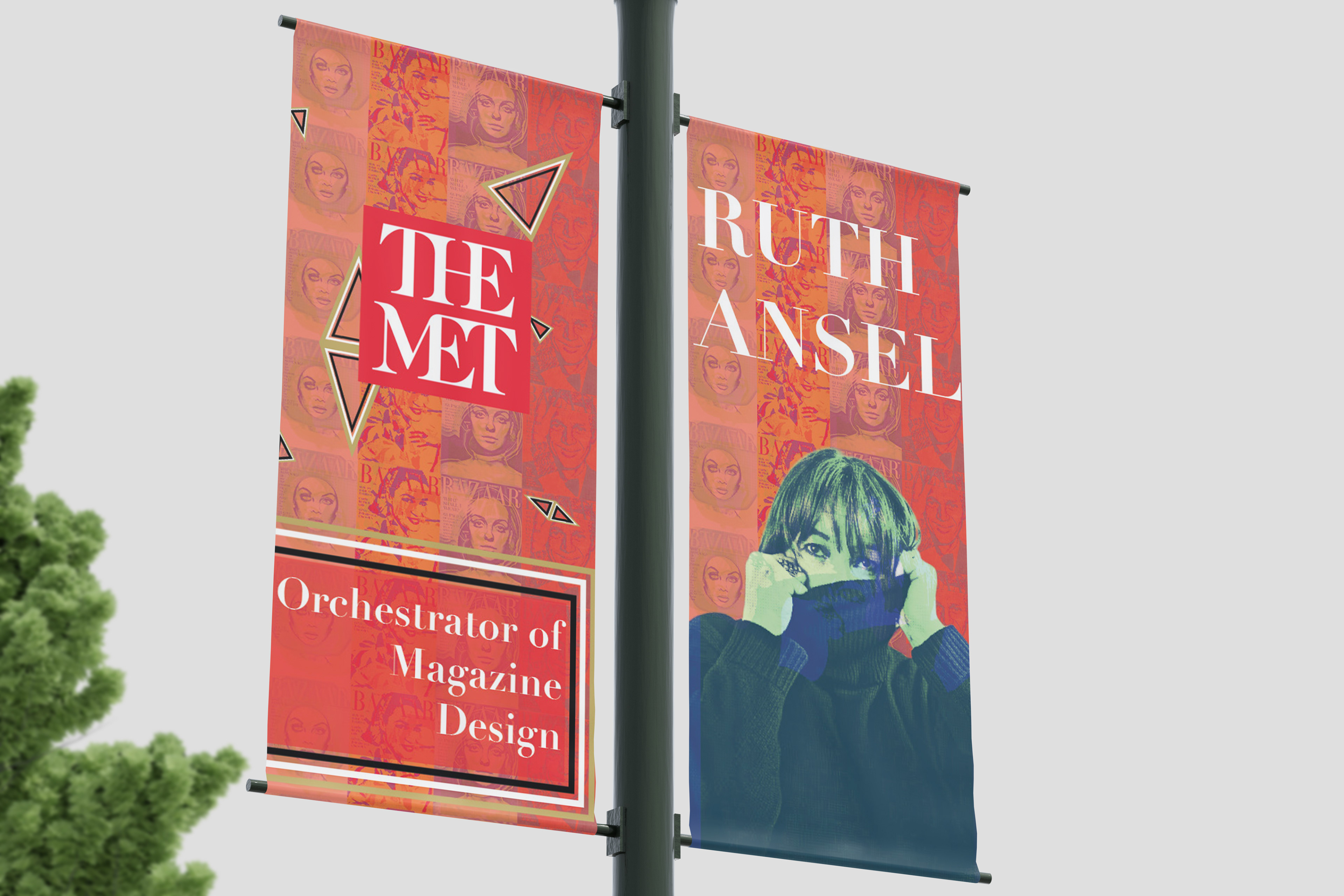
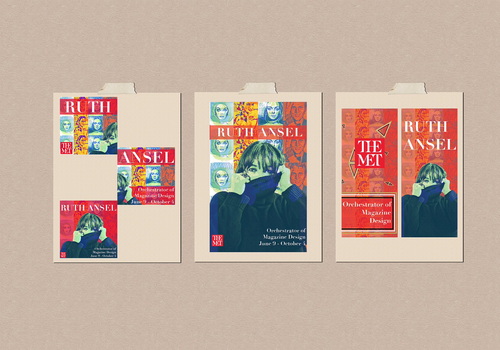
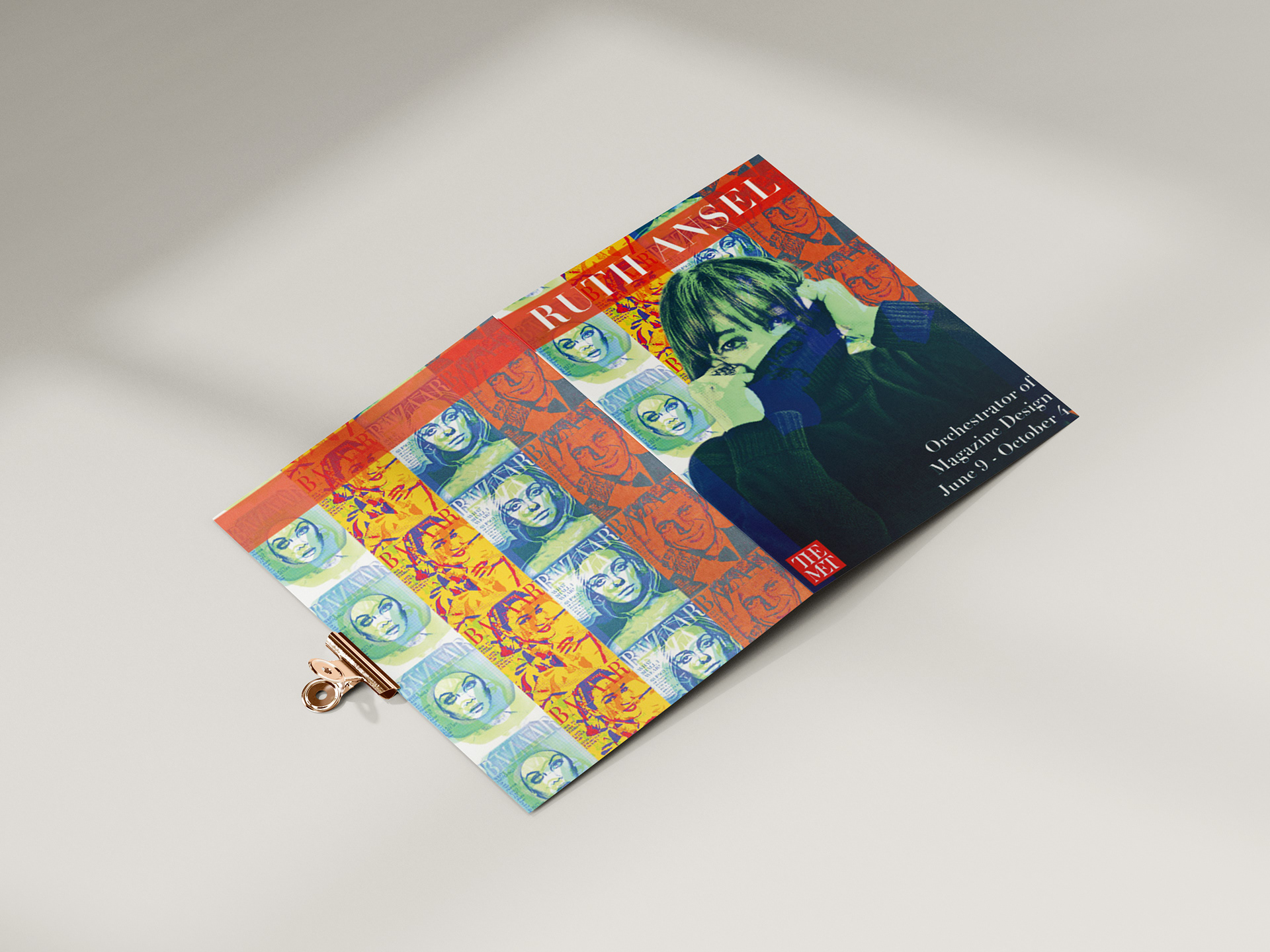
Using Instagram posts, booklets, and lamp post signage, visitors were able to be a part of this event at the museum. I made sure to include how the pole signage would look throughout the city, together with Instagram advertisements for those who show an interest in design. I made sure to look at a full-size lamp pole in Downtown Chicago and see if the detail inside of them would be visible and understandable.

CONCEPT BOARD
Challenges
My goal was to create a new design that showcased Ruth Ansel differently while still keeping the format of Bazaar Magazine, which is the usage of flushed left or flushed right along with the way images were showcased and exposed in the magazines.
DIGITAL ROUGHS
I also used particular shapes within the design to represent body silhouettes of fashion as a triangle shape, an hourglass shape, and a rectangle shape, which suggest variety. I chose colors that abided by her time at Harper’s Bazaar. Those colors were neon pink, red, white, black, and gold, which best-represented pop art and the elegance of street fashion.
FRONT/BACK COVER
Solution
Within this design, I tried to mimic a conventional exhibition by maintaining a manageable color palette while ensuring the design best represents pop art and the elegance of street fashion. In addition, a consistent grid helped to organize the content and allowed the transition from one to the next seamlessly.

INSIDE BOOKLET

INSTAGRAM POSTS